3+ Smartwatch
3+ Smartwatch Gen 2
3+ had a successful second-tier smartwatch with basic capabilities, and a unique hybrid platform featuring mechanical hands and a digital watch face. Their ambition was to use design to elevate the next generation into the next tier of smartwatches.
Immersion
Interviews and comparative product reviews revealed a number of insights
Bulky diver-style watches are heavy and unappealing to women and men alike
A three-day battery is not effectively better than a one-day battery
Redundant interaction modes confuse users
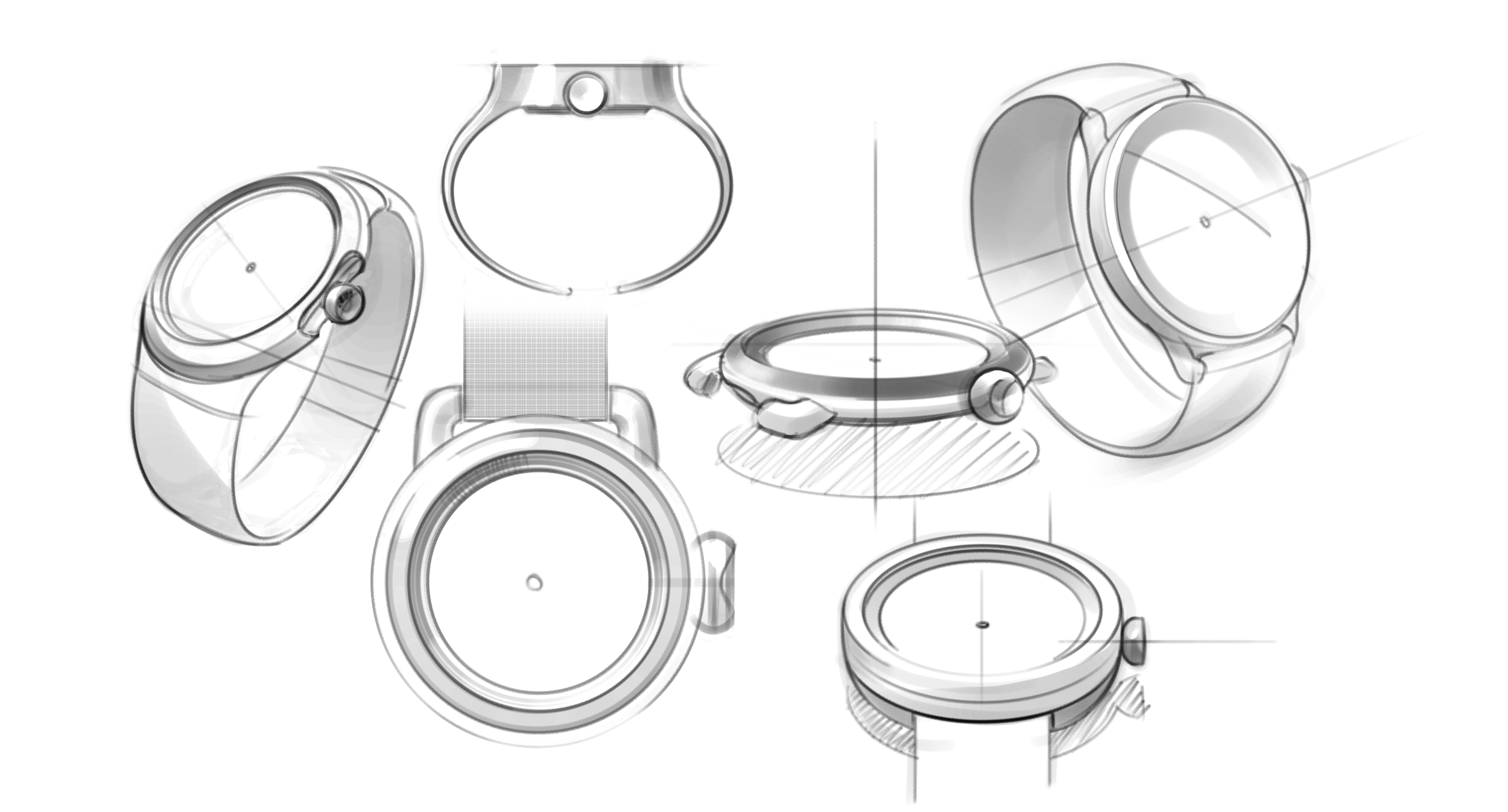
Design Direction
Respecting the inherent cyclical nature of time, we chose the circle as our primary design theme for bothe the ID and the UI. The circle is a comforting symbol of continuity and renewal, a theme we hoped to instill throughout the user experience.
Focusing on the theme of time as a continuous loop, we generated several concept directions which were later selected down based on defined criteria.